


Clearscore - Car insurance
Project overview
ClearScore aimed to simplify the car insurance application process for users by integrating personalised offers directly into their platform.
I was the UX Designer for this project and the team was made up of 4 devs, a product owner and a data analyst.
The main tools I used to complete the project were Figma, UserZoom, Miro & Adobe analytics
During the 6 months I had to deliver a solution for this project, I ran several user interviews, made a comparison analysis and gathered business needs from stakeholders and partners for this product.
Problem statement
Users found the car insurance application process lengthy and confusing, leading to frustration and potential abandonment.
How might we make car insurance journey feel effortless?
Market scan
Outdated Design & Cognitive Load: Several car insurance sites had dated designs, and participants noted that the cognitive load was too high for a task that is essential for car usage
Lengthy Multi-Page Forms: Many websites required users to scroll through 3-4 pages to input all necessary data, leading to higher abandonment rates and an increased likelihood of errors
Complex Input Fields: A mix of text fields, calendars, drop-downs, and embedded CTAs within sections made the flow overwhelming and harder for users to navigate
Car Insurance map
This high-level user flow outlines the key steps in getting a car insurance quote—from choosing cover type to viewing results. Designed for clarity and speed, it supports both quick quotes and deeper detail entry, guiding users through a streamlined, decision-friendly experience.

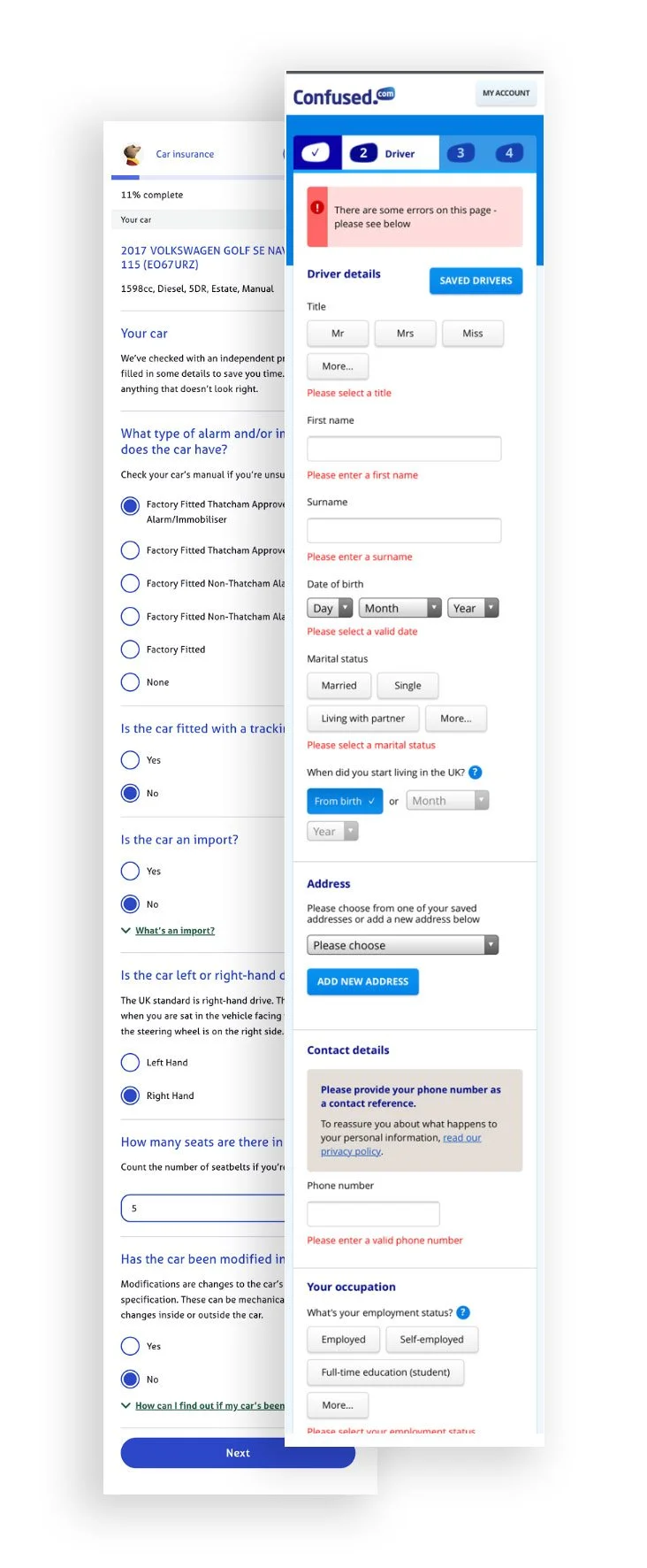
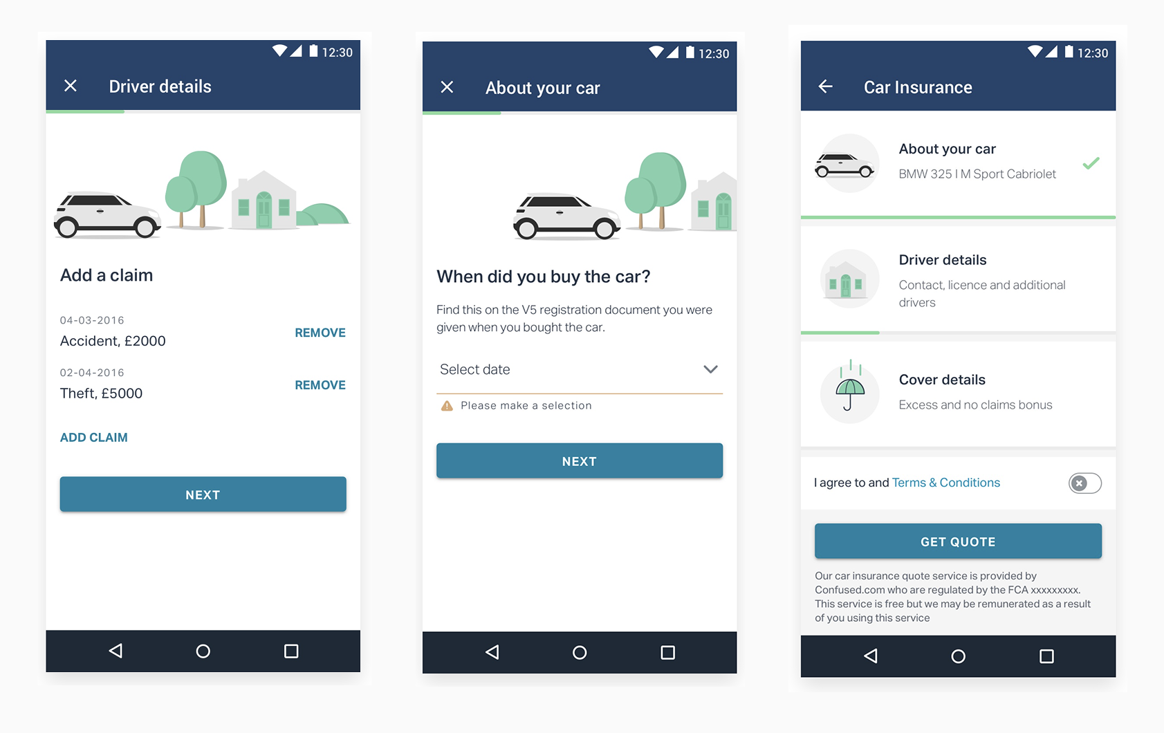
Car Insurance Form – Step-by-Step UI
These screens are part of a guided, multi-step flow designed to collect key car insurance details. The layout emphasizes ease of use, helping users enter claims, ownership info, and driver details with minimal effort. Progress indicators, helpful prompts, and consistent visuals ensure a smooth and reassuring quote process.
Car Insurance Results & Detail View
I designed a results screen that helps users quickly compare car insurance offers and explore policy details with ease. The results screen surfaces key costs, excess amounts, and included benefits, while the detail view provides a clear breakdown of cover options. The layout supports toggling between monthly and yearly pricing, helping users make informed decisions with minimal friction.


User testing showed strong results - participants appreciated the clarity of cost breakdowns and the ability to easily compare included and optional cover. This led to higher confidence in decision-making and faster selection times.
Insurance Quote Screens – Partner Integration UI
I designed a set of clean, consistent quote screens for various insurance products (home, car, energy, and pet), each clearly communicating third-party partnerships. The layout prioritizes trust, clarity, and ease of action—guiding users to get a quote quickly while feeling confident in the provider.

Mortgage Comparison UI – Evolved from Proven Car Insurance Design

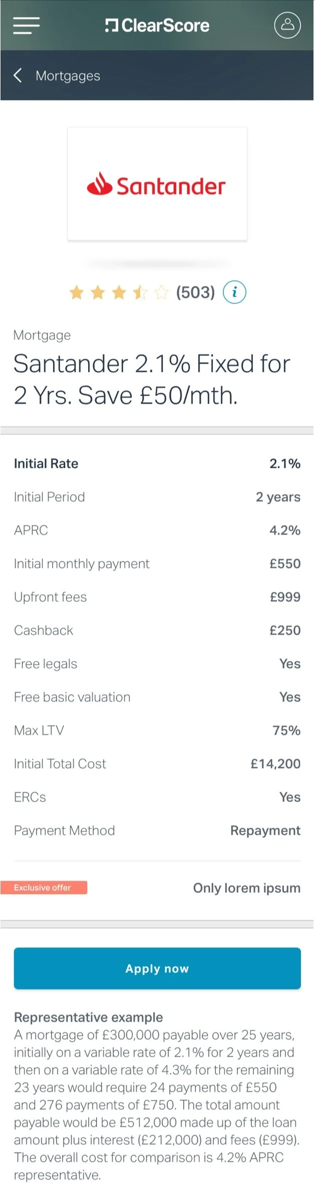
Following strong results from the redesigned car insurance UI, this layout was adopted across other products like mortgages. It surfaces key info—repayments, APR, fees—at a glance, with clear tags and actions to support quick, confident decisions.
Business objectives
18% of users that start the journey has to get to the results page.
10% of these users should get a policy through ClearScore.
Make users feel that getting a car insurance policy doesn’t have to be a dreadful experience.
